


Exploring the rise of the utility-first CSS framework that’s changed the game. Here’s how Tailwind became popular and why I’ve refused to use any other CSS solution since the year 2020
How Did Tailwind CSS Get 70,000 Stars on GitHub?
From the dawn of the web, CSS (Cascading Style Sheets) has played a vital role in web development, adding the stylistic flair that separates dull, static pages from vibrant, interactive sites. I started building websites before CSS was invented, and yes, those plain HTML sites were UGLY!
Over the years, various CSS frameworks and approaches such as Bootstrap and BEM (Block-Element-Model) have offered developers convenience and speed. However, there’s a new reigning champion: Tailwind CSS. Since its initial release in 2017, Tailwind has gained massive popularity among developers. But what sets Tailwind CSS apart from other approaches?
Flexibility Reigns Supreme: Tailwind > Bootstrap
When using conventional CSS frameworks like Bootstrap or component libraries like Material UI, components come predefined with their style. This feature, while convenient, is incredibly restrictive, especially when developers are working with professional designers who want a ton of customization, responsiveness, and interactivity in their apps and sites.
Tailwind CSS introduced a fresh paradigm: utility-first. Instead of wrestling with overbearing default styles, now we start with barebone HTML (or JSX) and build our designs from the ground up, applying classes that directly correspond to CSS properties but are much shorter to type out — especially for media queries. Initially, this granular control feels weird, but it affords developers unparalleled flexibility.
Customizing predefined components to fit a unique design can be an enormous struggle. In my experience, unless the designer is already comfortable with whatever prebuilt approach the developer is using, then the developer will not save any time using pre-built components.
Even worse is the feeling of trying to implement a complete design system using a coarse tool like Material UI. It seems great at first, but once you’re out of the prototyping stage, you’ll start having theming nightmares.
To address this issue, Tailwind CSS provides a highly customizable system. With the help of the configuration file, tailwind.config.js, developers can adjust the framework’s default theme, define custom colors, spacings, font sizes, and much more. This level of customization facilitates the creation of unique designs without straying away from the framework’s philosophy.
More importantly, Tailwind CSS provides a pre-built template for a design system. You want a darker pink? Forget about hex codes; you’re just going to switch Barbie bg-pink-400 to a slightly darker bg-pink-500. It’s that easy.
Uncovering the Origin Story of Tailwind CSS
Tailwind CSS was born from the minds of Adam Wathan & Steve Schoger. Adam Wathan is a full-stack developer known for his “Refactoring to Collections” book and numerous video courses on web best practices. Wathan had previously been a fan of Bootstrap and even created a course on it. But over time, he found himself frustrated with the rigidity of pre-designed components and shared his sentiments openly on Twitter.
Following a series of tweets critiquing the traditional CSS framework model, Wathan announced in October 2017 that he was building his own CSS framework, initially named “Functional CSS.” This new framework didn’t take long to generate buzz in the online developer community.
The framework’s unique selling point is its utility-first philosophy, which gives developers maximum control over styling while eliminating the need to write custom CSS for individual components. In contrast to traditional frameworks, which often required overriding predefined styles, this utility-first approach provided a granular level of control right out of the box.
The Transformation: Functional CSS to Tailwind CSS
As work on the project progressed, it became apparent that the term “Functional CSS” was too generic for such a unique framework and approach. Thus, in early 2018, Wathan rebranded it as “Tailwind CSS.” The name was a fitting metaphor for the mission: to create a tool to help professional developers sail smoothly through the choppy seas of CSS.
Since its rebranding and official launch, Tailwind CSS has been growing exponentially in popularity. The adoption of the framework has been aided by its developer-focused design and an active community of developers who regularly contribute to its ecosystem. The 2020 release of Tailwind UI was a significant milestone that provided a vast library of ready-made components, further enhancing the framework’s appeal.
I switched exclusively to building with Tailwind CSS in 2020 and have steadfastly refused any professional project or team not using Tailwind. Yes, I am 100% team Tailwind, so I won’t even talk to a recruiter if they don’t know the CSS approach inside the frontend team. And a big reason I use Tailwind is that it’s great for performance!
PurgeCSS: A Lean and Mean Approach to Efficiency
Many developers may raise their eyebrows at the prospect of a utility-first CSS framework, given the potential for file size bloat. The idea here is that if you load “every possible Tailwind CSS” class, you will end up with a particularly large CSS file. This concern, while valid, is obliviated by how Tailwind uses PurgeCSS automatically, with no configuration required.
PurgeCSS significantly reduces the size of the final CSS file by removing unused classes from the stylesheet, thus ensuring that your production build is as lean as possible. Because of PurgeCSS, Tailwind’s utility-first approach doesn’t inflate the file size, making it a viable option for performance-conscious projects. It should be your default option if you care about web performance (and core web vitals)!
To justify that claim, let’s very briefly touch on the alternatives. If you’re using CSS-in-JS, you’ll bloat every single component and have zero reusability, so let’s say you end up with 100 KB of data transfer. The BEM model will be similar since you’ll type display: flex; into several dozen separate components, resulting in ~100 KB of data transfer.
You could theoretically optimize a regular CSS file, with or without PurgeCSS, but I’ve never seen anyone do it. Typical professional-grade CSS files tend to be 10,000 lines or more, and you generally can’t remove anything to prevent breaking things, at least not without a tool like PurgeCSS. In comparison, Tailwind CSS will only send the required CSS, which usually results in just 20–40 KB of data transfer for a big website.
The Developer Experience Is Intuitive and Simple
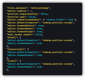
The rise of Tailwind CSS can’t solely be attributed to its technical features. The overall developer experience it provides is a big factor in its popularity. Once I got used to it, I found Tailwind intuitive; putting the classes right in the HTML feels normal, and it’s less typing than CSS. Plus, there’s Tailwind CSS Intellisense and a Tailwind Prettier extension.
What do I mean when I say one of the key attributes of Tailwind CSS is its intuitive nature? Well, let’s take the display: flex; example. In Tailwind, that becomes flex. Easy, consistent, memorable, and short class names are intuitive, at least after the initial learning curve. The whole point is to use human-readable class names that map closely to their CSS property counterparts. This attribute makes Tailwind CSS relatively easy to pick up, particularly for those with existing knowledge of how CSS works.
Additionally, I find the mental load so much simpler than when I was using regular style sheets (whether CSS or SASS). We all know inline styles prevent reusability. Inline styles cause code bloat compared to a regular CSS file with reusable classes; they make your code hard to read and extremely difficult to maintain since your codebase is not DRY.
But switching back and forth all day to a CSS file is a huge burden, especially when trying to find each media query for three or four different screen sizes. Something like BEM helps reduce the chance of accidentally changing something you didn’t mean to, but you’re still splitting your time looking at HTML in one file and CSS in the other. I find Tailwind CSS much faster and easier to write because it all goes in the same file as the HTML!
Tailwind’s Thriving Community and Resources
Tailwind CSS boasts a thriving community that contributes to its growth. The availability of tutorials, resources, and plugins built around Tailwind makes learning and using the framework more accessible. A great example is the “Line Clamp Plugin,” which automatically shortens lines using an ellipsis (…). That plugin was so popular that now it’s built-in to Tailwind!
Additionally, the Tailwind development team frequently communicates with the community, making updates and refining the product based on user feedback. The other example I should mention is that you can now use arbitrary styles such as w-[1.2rem]instead of only built-in classes (w-4) or those that you’ve added to the theme via the tailwind.config.js file. (w-button?). That’s “Just In Time” in action.
Tailwind UI: Here Are Your Prebuilt Components!
Tailwind UI, a commercially-available component library built with Tailwind CSS, has also played a part in the framework’s success. You get easy-to-customize prebuilt components that are beautifully designed, fully responsive, and carefully crafted. While I find the Tailwind UI components to be a little poorly-documented — they usually lack comments — they’re super handy as a starting point for frontend development.
Tailwind UI seamlessly integrates with existing Tailwind CSS projects, no matter if it’s a greenfield (brand-new) project or something much further along. If you’re stuck, reaching for a Tailwind UI example component is a perfect fit for developers looking to expedite the building process without sacrificing quality. Although it’s a paid resource, it’s a pretty huge library that gets frequent updates, so I’ve found it a good investment.
For when I need to build something complex for the web from scratch, then I just use the open-source version of Tailwind UI called Headless UI. Headless UI provides fully-accessible, unstyled UI components for many common frontend patterns, such as Listboxes (Dropdowns) or Dialogs (Modals). Additionally, the examples of each component are styled with — you guessed it — Tailwind CSS, making them easy to drop into a project.
Wrapping Up: Why Tailwind CSS Became So Popular
In conclusion, the popularity of Tailwind CSS can be attributed to its utility-first philosophy, high degree of customizability, automatic out-of-the-box performance optimizations, and developer-first approach. That combination of features results in code that’s faster to write than regular CSS (since it’s fewer characters to type) and that reduces mental load with its “just one file” approach (instead of hopping back and forth to CSS files).
In other words, Tailwind CSS became so popular because it meets the technical demands of modern web devs and provides a delightful developer experience. You can even use it for React Native development with the NativeWind extension! Tailwind CSS is not a fad; it’s an amazing tool shaping the future of how we write and think about CSS.
In that article, which can be a bit hard to understand the first time you read it, Adam explains that to write components effectively, we need enforced consistency: a common language and approach for everyday tasks like adding “a little more padding” or darkening “one shade.” Tailwind!
Happy coding! ✈️